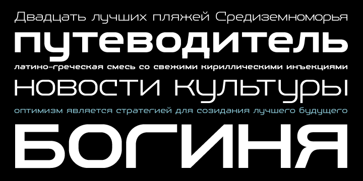
Novecento Slab шрифт
03.01.2022
- Лицензия: Бесплатный шрифт
- Поддержка языков: Латиница
- Теги: decorative, slab, брусковые, вестерн, декоративные, дикий запад, старые американские
Информация о файле шрифта:
- Версия:Version 1.001;PS 001.001;hotconv 1.0.70;makeotf.lib2.5.58329
- Компания:Jan Tonellato
- Дизайнер:Jan Tonellato
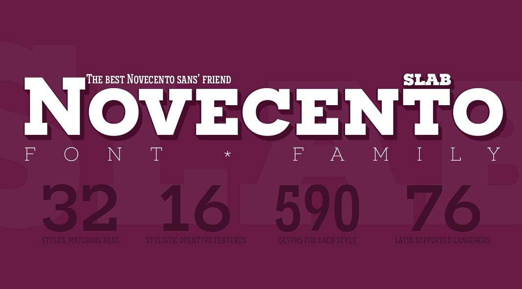
- Короткое описание:OVERVIEW: Novecento Slab is the �slab serif� companion of Novecento Sans, an uppercase + smallcaps font family inspired on european typographic tendencies between the second half of 19th century and first half of the 20th. As the excellent French typographer Xavier Dupr� said �it seems to have been cast in concrete�. Despite its blocky look, Novecento Slab�s lettershapes are optically corrected and balanced. This font face is designed to be used mostly for headlines, visual identities or short sentences, both in big and small sizes. Novecento Slab family was spaced and kerned with love and patience; each font has between 750 and 950 group kerning pairs. This font is available for licensing in opentype and webfont format, as well as for mobile apps, ebooks and for software embedding. OPENTYPE FEATURES: AALT Accesses All Alternate glyphs from the Glyphs panels in Adobe Illustrator or Indesign. CASE Sets All-Caps to activate case sensitive forms: transform lowercase letters, figures and some extra signs to Uppercase; vertically aligns math symbols and punctuation. DNOM & NUMR Transforms 0 to 9 figures into numerators (aligned to cap height) and denominators (aligned to baseline). FRAC Custom fractions generation feature. SUPS Transforms 0 to 9 figures into superiors. LOCL Romanian, Moldavian and Polish advanced diacritics support; automatic Catalan punt volant; Dutch localization for accented ij; localization for Turkish i (works also for Kazakh, Tatar, Crimean Tatar, Azeri. Just select your text language to activate the localized accents) CALT detects German � in an uppercase string and substitute it with its uppercase version/ SS01 / SALT Alternate Q letter shape for ultra narrow line heights. Implemented both as Stylistic Set n�1 (ss01) and Stylistic Alternate (salt) to maximize compatibility between applications. SS02 / SALT Alternate N letter shape. Implemented both as Stylistic Set n�2 (ss02) and Stylistic Alternate (salt) to maximize compatibility between applications. SS03 / SALT Alternate I letter shape. Implemented both as Stylistic Set n�3 (ss03) and Stylistic Alternate (salt) to maximize compatibility between applications. SS04 / SALT Alternate J letter shape. Implemented both as Stylistic Set n�4 (ss04) and Stylistic Alternate (salt) to maximize compatibility between applications. SS05 / SALT Alternate Y letter shape. Implemented both as Stylistic Set n�5 (ss05) and Stylistic Alternate (salt) to maximize compatibility between applications. LNUM/ONUM Lining / oldstyle figures; LNUM transforms numbers and monetary symbols in Uppercase; ONUM do the opposite (default figures are ONUM). TNUM / PNUM Tabular/ proportional figures. Figures (numbers, monetary and math symbols) of same width always align, in spite of their weight. ZERO / SALT Slashed zero alternate glyph. Works with tabular and proportional figures, numerators, denominators and superiors. Implemented both as Zero as Salt to maximize compatibility between applications.
- URL:http://typography.synthview.com
- Лицензия:Please refer to the EULA (End User License agreement) you received with this software.