Optima шрифт

16.01.2022
- Лицензия: Платный шрифт
- Поддержка языков: Латиница
- Автор: Linotype
- Теги: serif, антиква, с засечками
Информация о файле шрифта:
- Версия:1.00 Build 1000
- Торговая марка:Optima is a trademark of Monotype Imaging Inc. registered in the U.S. Patent and Trademark Office and may be registered in certain other jurisdictions.
- Компания:Monotype Imaging Inc.
- Дизайнер:Hermann Zapf
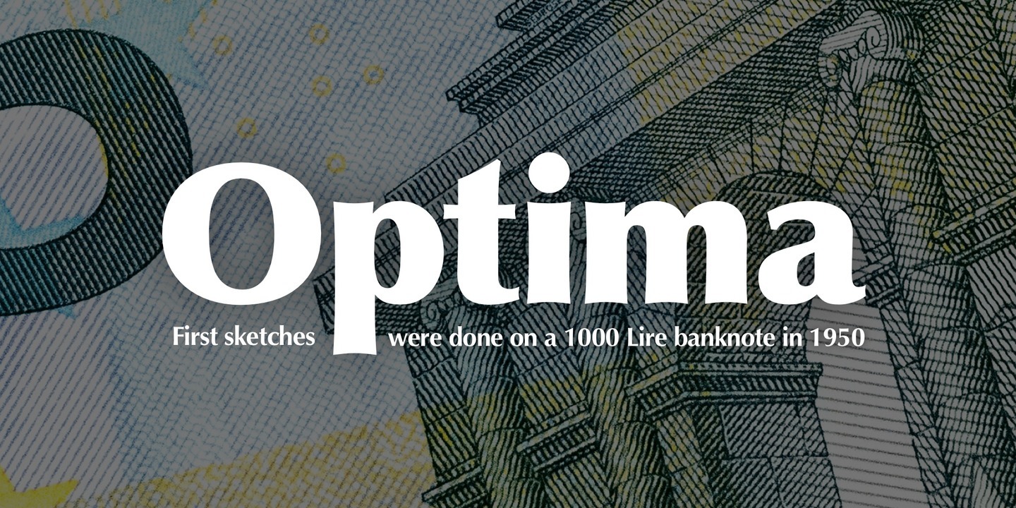
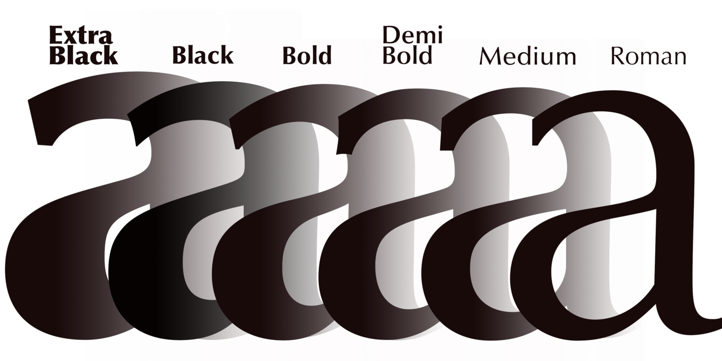
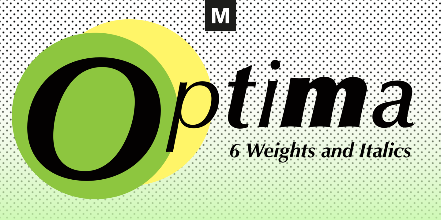
- Короткое описание:Optima was designed by Hermann Zapf and is his most successful typeface. In 1950, Zapf made his first sketches while visiting the Santa Croce church in Florence. He sketched letters from grave plates that had been cut about 1530, and as he had no other paper with him at the time, the sketches were done on two 1000 lire bank notes. These letters from the floor of the church inspired Optima, a typeface that is classically roman in proportion and character, but without serifs. The letterforms were designed in the proportions of the Golden Ratio. In 1952, after careful legibility testing, the first drawings were finished. The type was cut by the famous punchcutter August Rosenberger at the D. Stempel AG typefoundry in Frankfurt. Optima was produced in matrices for the Linotype typesetting machines and released in 1958. With the clear, simple elegance of its sans serif forms and the warmly human touches of its tapering stems, this family has proved popular around the world. Optima is an all-purpose typeface; it works for just about anything from book text to signage. It is available in 12 weights and 4 companion fonts with Central European characters and accents. In 2002, more than 50 years after the first sketches, Hermann Zapf and Akira Kobayashi completed Optima nova, an expansion and redesign of the Optima family.
- URL:http://www.monotype.com/